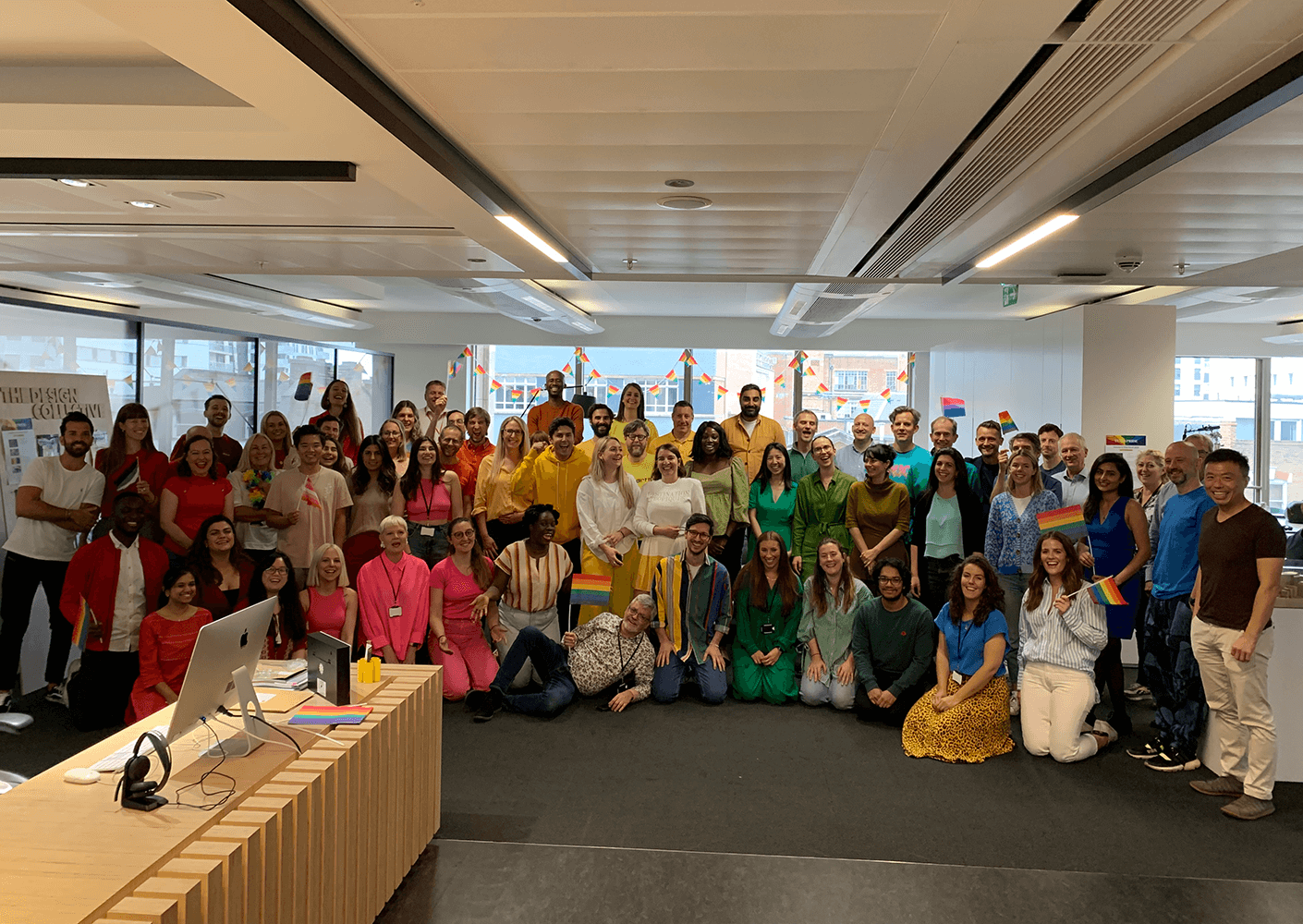
Welcome to our London studio
The challenges of an ever-complex world require boundary pushing solutions. As a hub of collaboration, our London studio recognises that it is the combined knowledge and expertise of our multiple design disciplines that allows us to be greater than the sum of our parts; delivering whole places that are holistically responsive in both approach and activation.
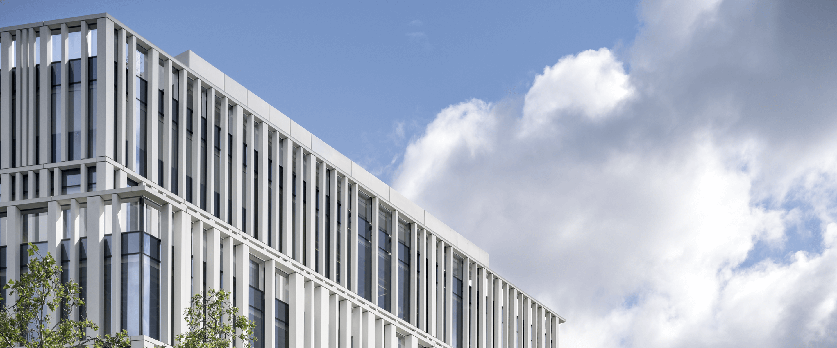
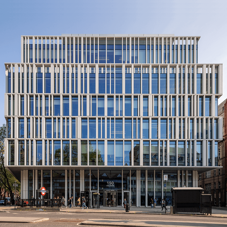
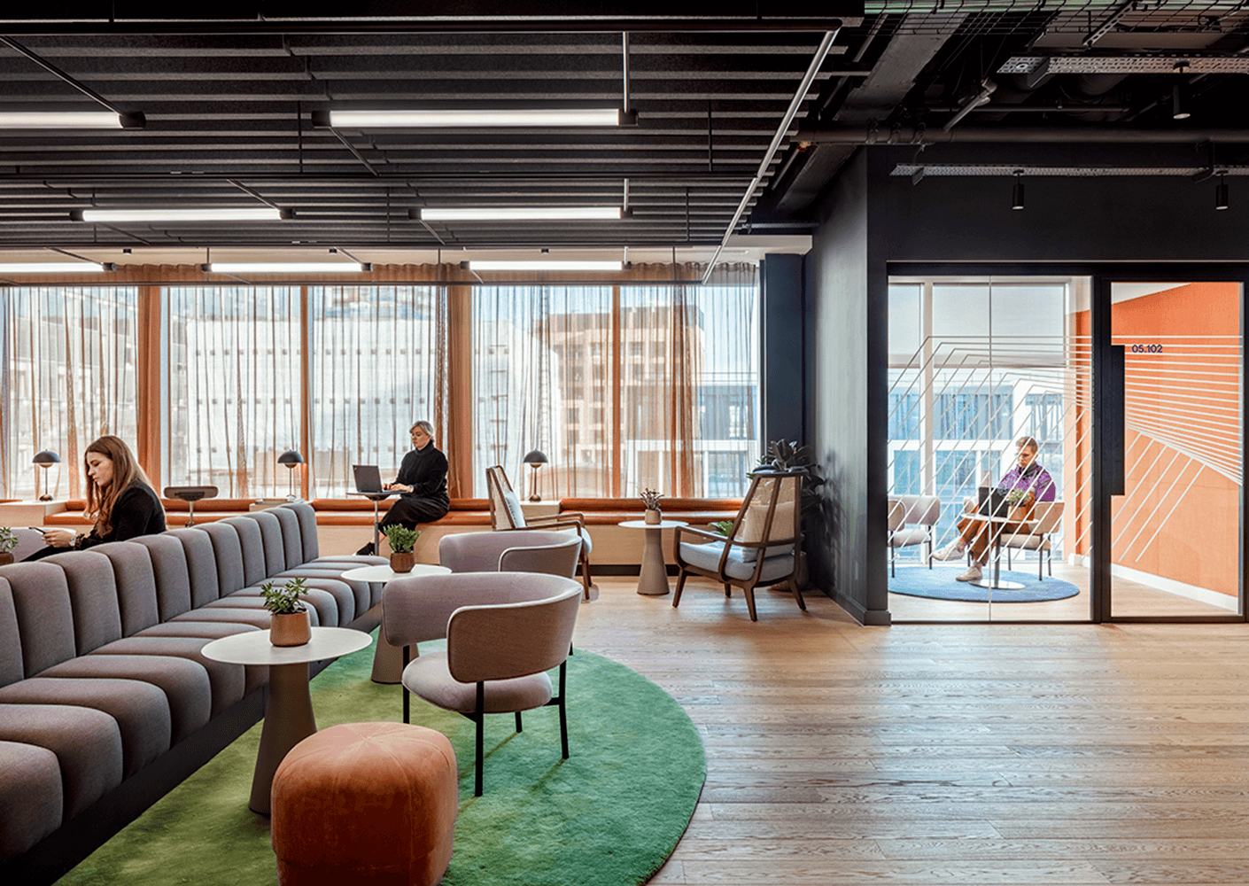
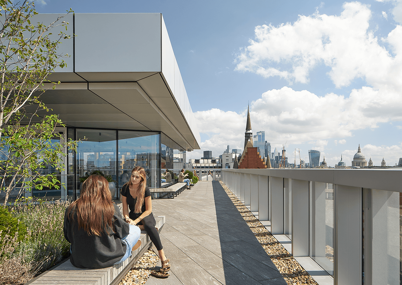
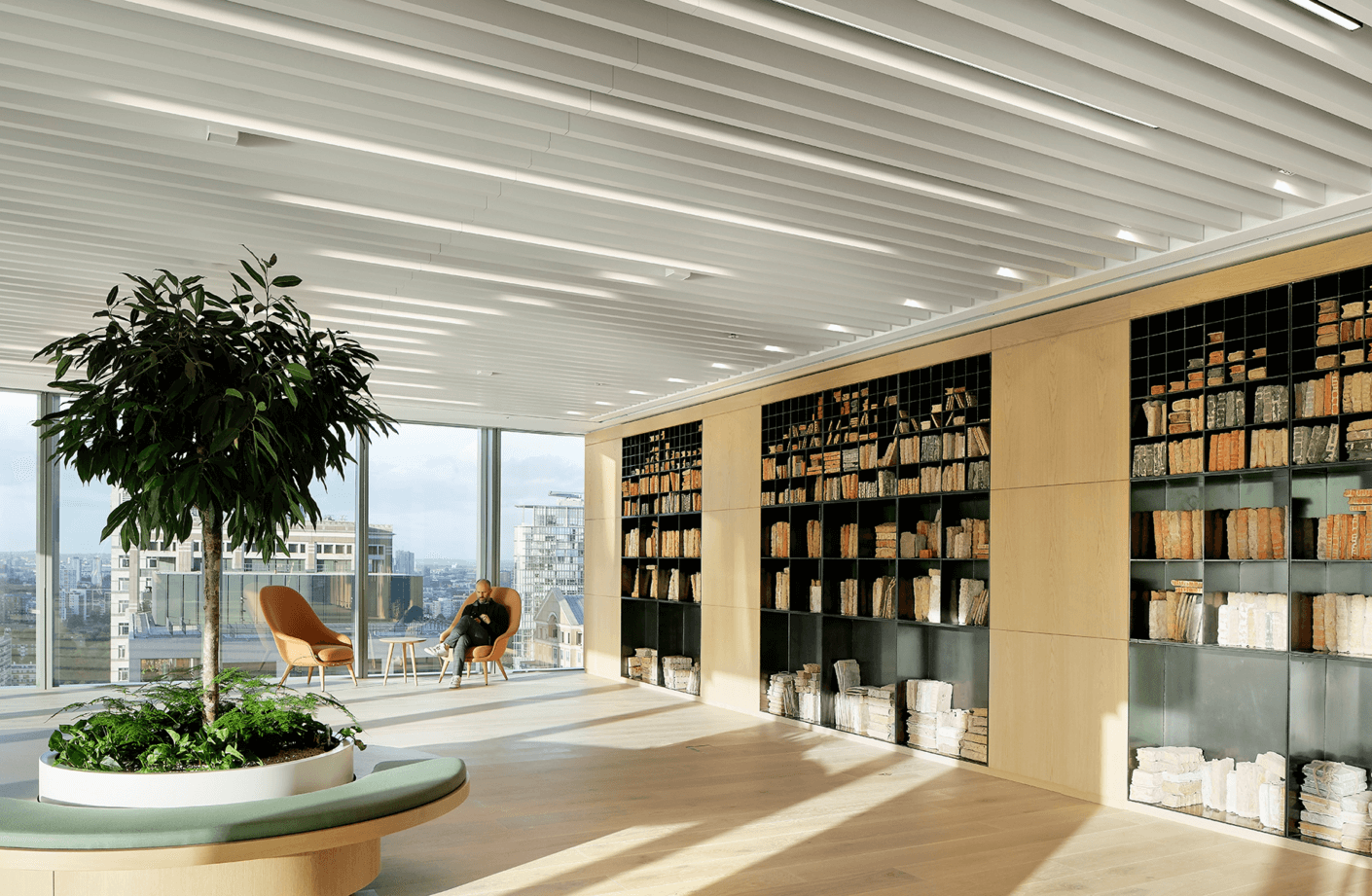
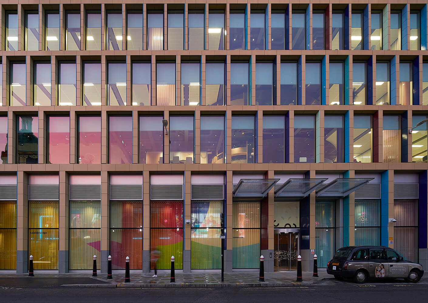
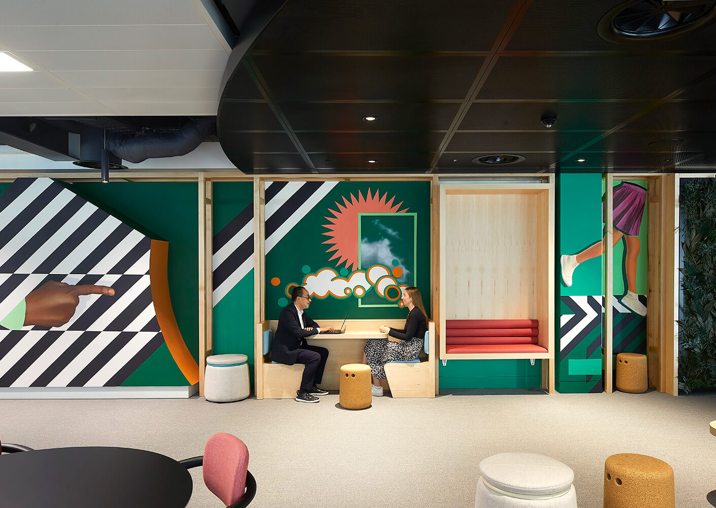
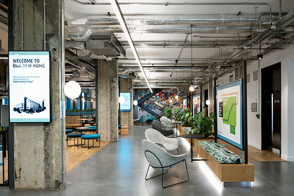
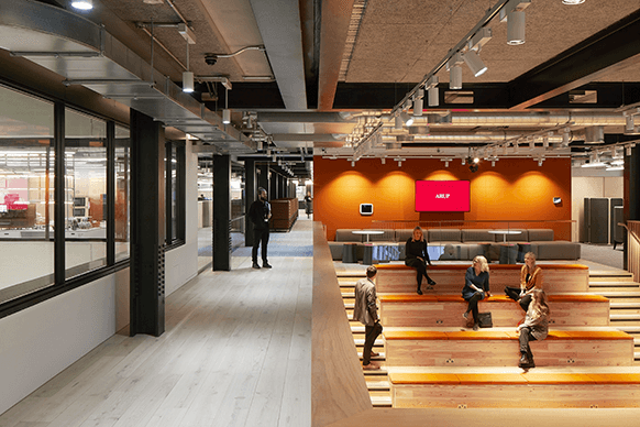
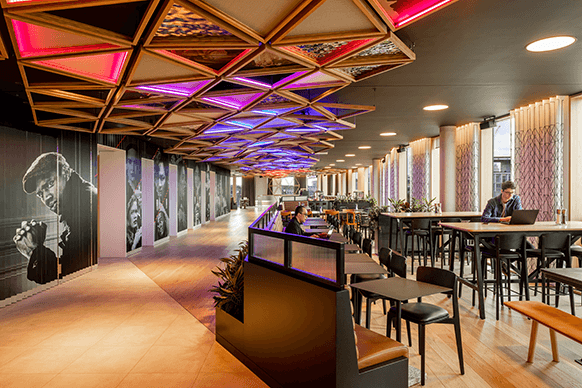
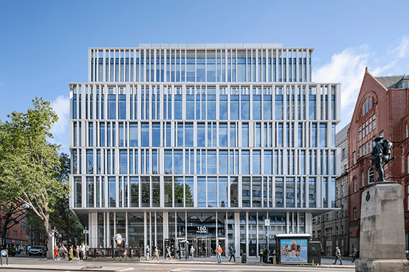
Perkins&Will’s Living Design philosophy sits at the heart of our home in London’s midtown district. The framework has been central in 150 Holborn’s evolution as a living lab that supports our commitment to deliver research-driven, human-centric design. It is an empowering place designed with inclusion at the heart, driven by individual agency and self-organisation, where design is the common language for connections.
See our Modern Slavery and Human Trafficking Policy here.
See our carbon tracking and carbon reduction pathway here.
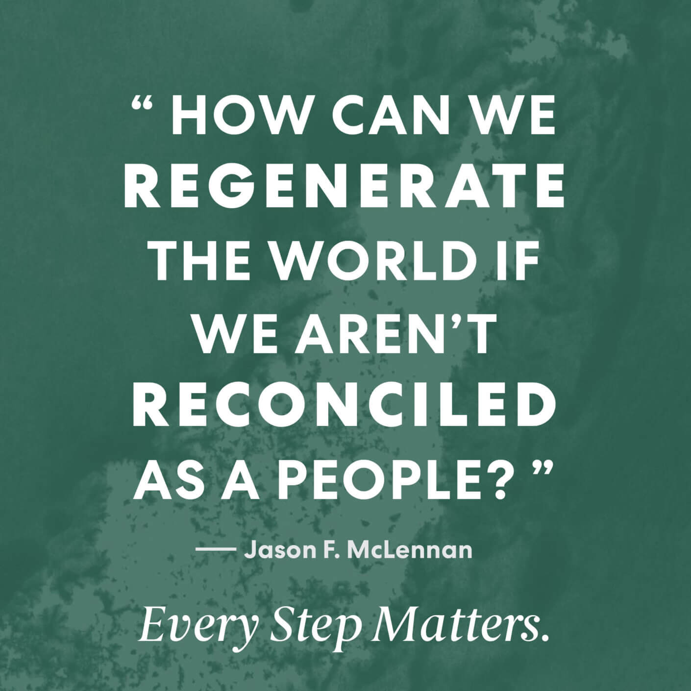
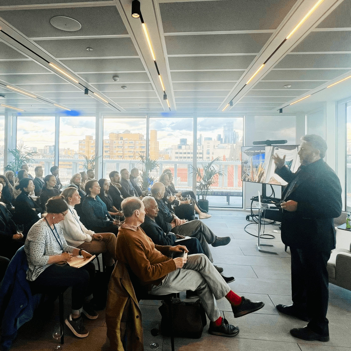
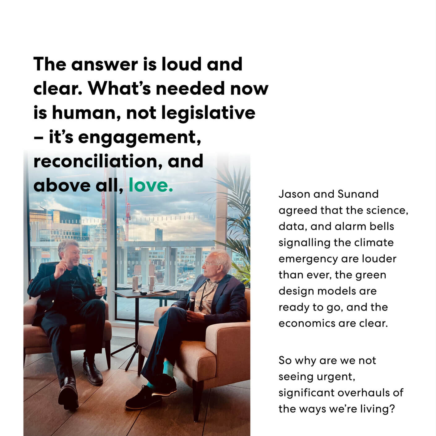
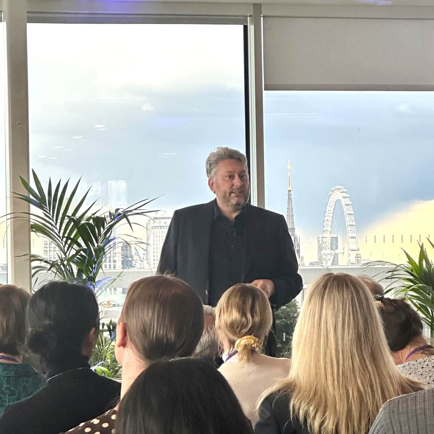
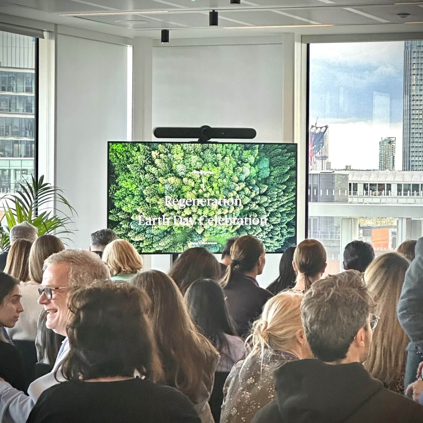
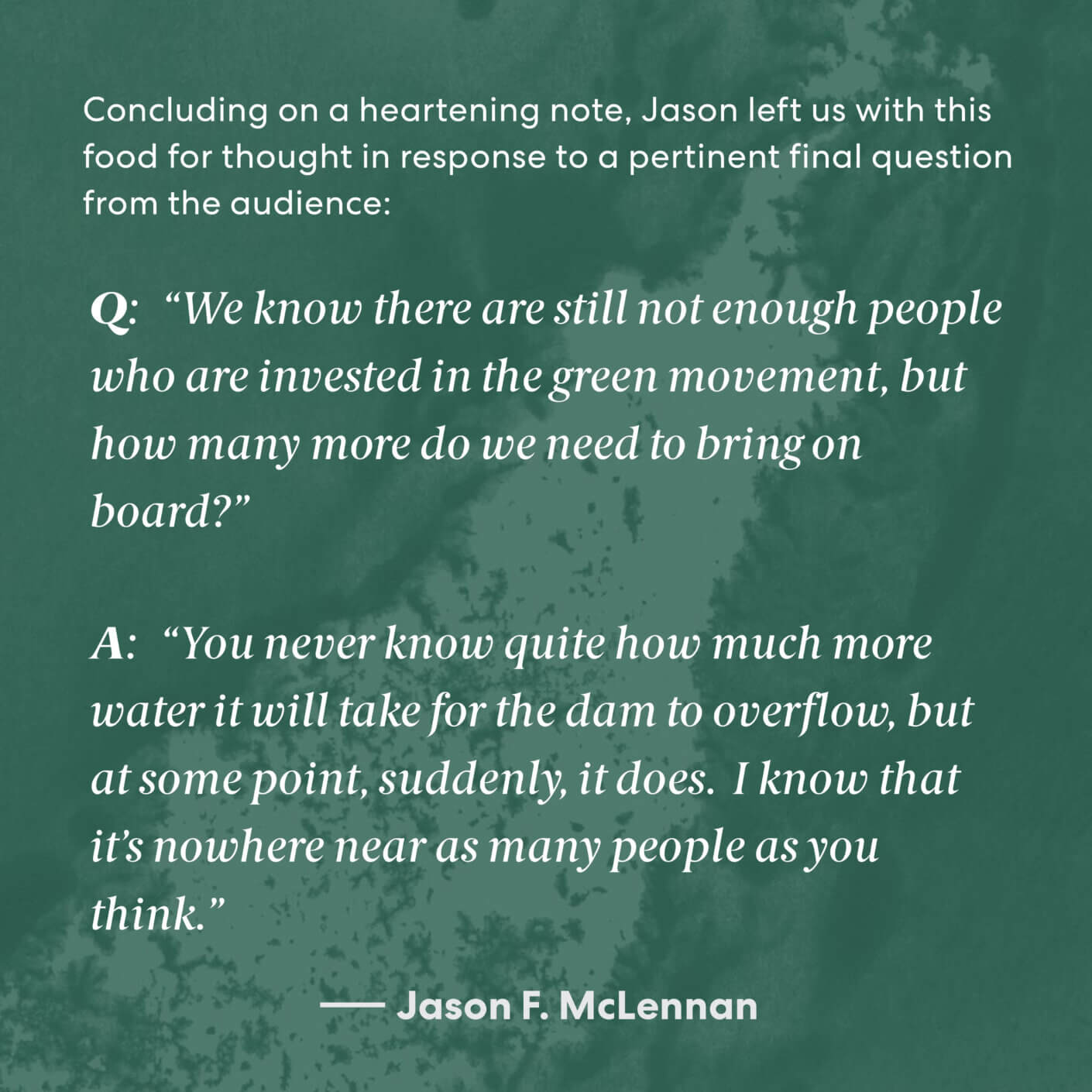
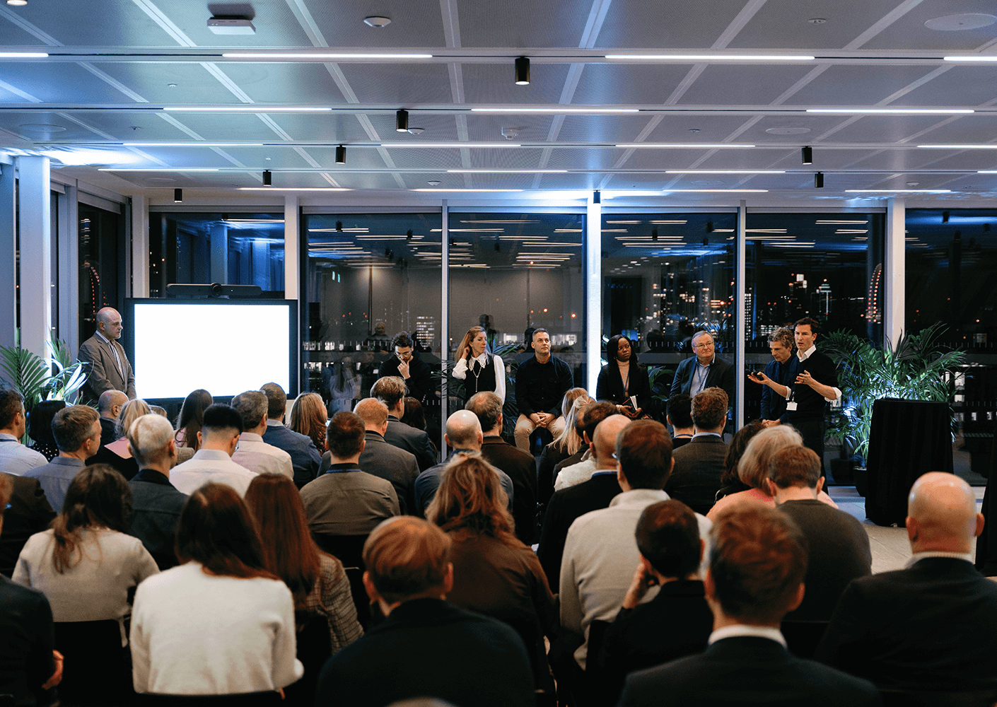
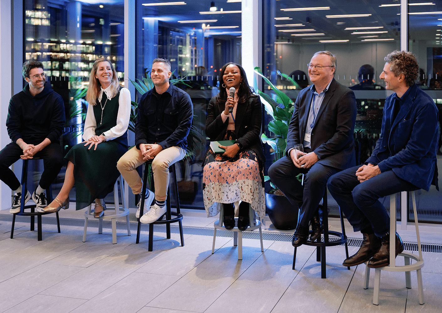
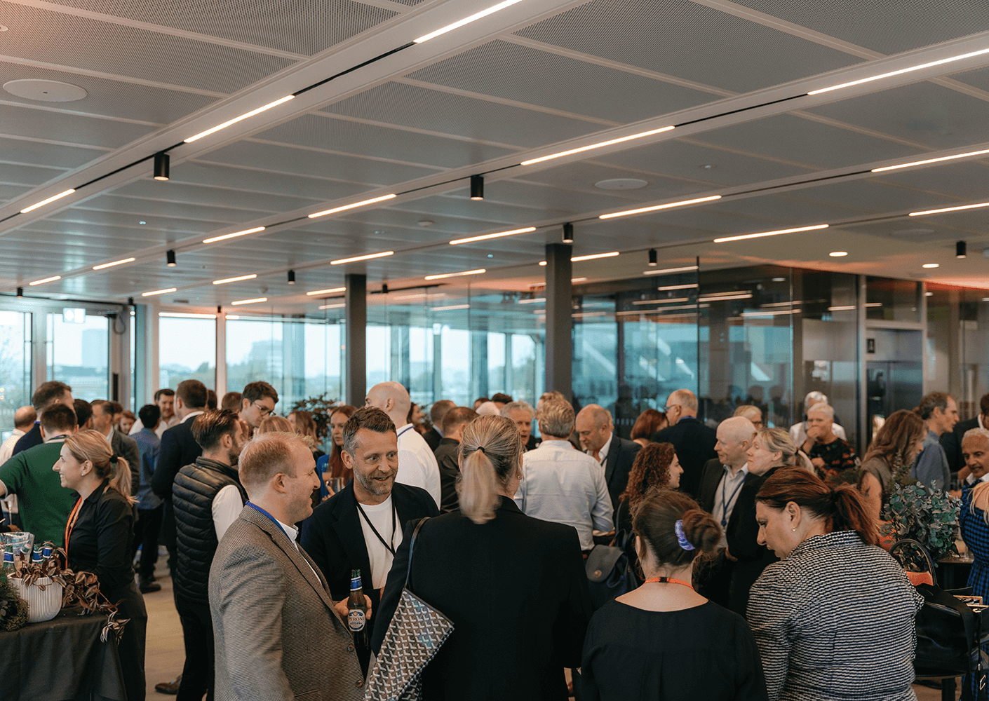
Thank you to Jason F. McLennan, Perkins&Will Managing Director, and Sunand Prasad OBE, Perkins&Will Principal, for a truly inspiring evening at #EveryStepMatters – hosted in our London studio to mark Earth Day.
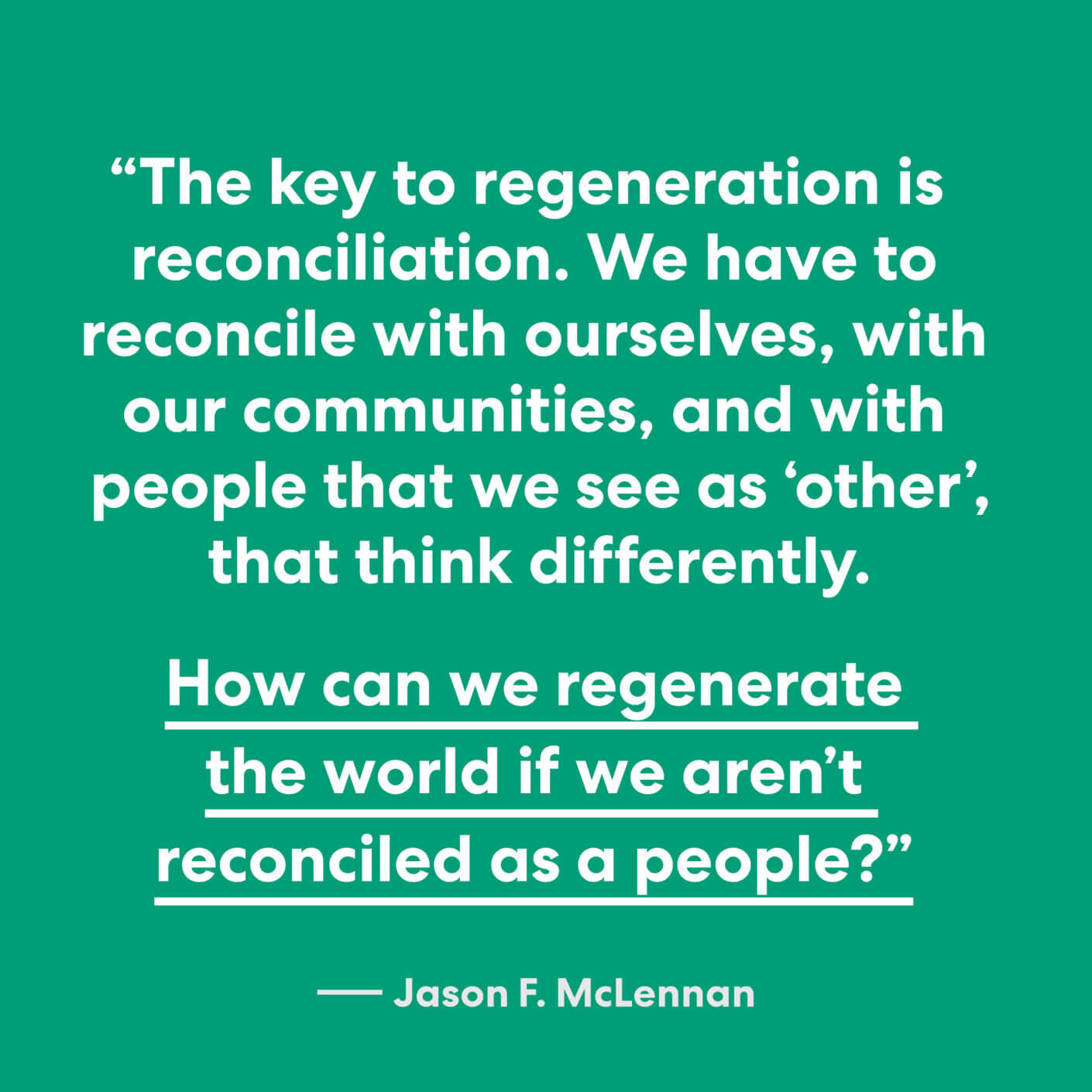
Jason took us on a moving past-to-future journey through regenerative thinking, and in the fireside chat that followed, Sunand and Jason explored how human nature is reticent to change. They asked us: what are the biggest barriers to achieving meaningful, tidal shifts in the global green movement?
The answer was clear. What’s needed now is human, not legislative – it’s engagement, reconciliation, and above all, love. Far from a cliché, Jason’s call for love to be a greater part of the environmental movement urged the audience to embrace, and patiently bring on board, those whose perspectives differ from our own.
Visit Jason’s profile page here to read more about his work and calls to action.
On 21st February, Perkins&Will launched ‘Where, Matters’ – the latest piece of thought leadership from the London studio which seeks to explore the role of place and people in relation to the science sector.
‘Where, Matters’ asks the question: as the race for the top talent in the science market continues to hot-up, what role does place play in supporting organisations to attract and retain the best talent?
As part of the London launch event, our brilliant panel of speakers highlighted that place is undoubtedly of growing importance for the science sector, and that top talent today look beyond salary, career development, and job security, towards inspirational and sustainable workplaces that nurture innovation, creative exchange, and wellbeing.

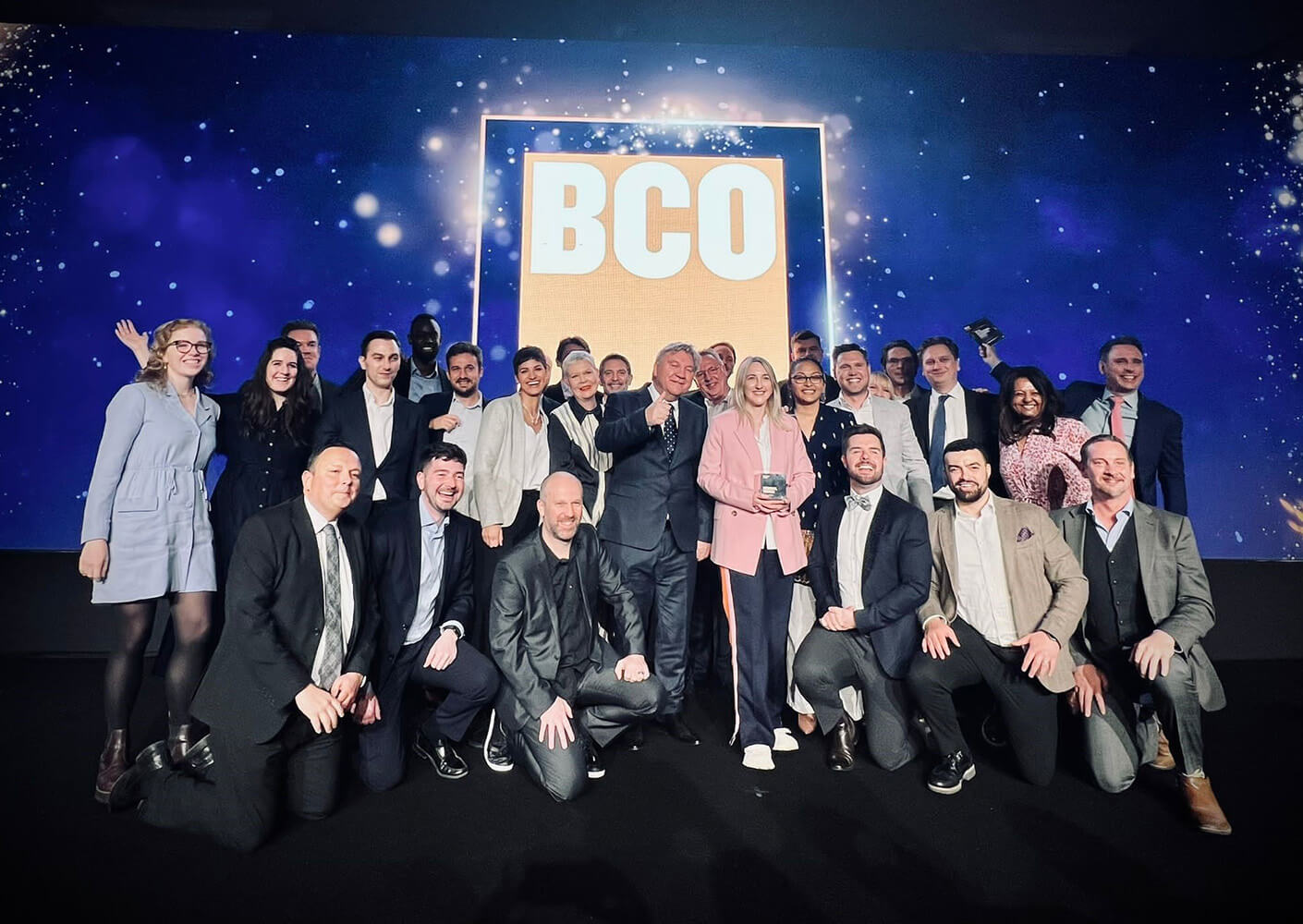
The BCO Awards 2024 Shortlist is in! And four projects designed by our London studio have made the cut.
Our self-designed home at 150 Holborn has been shortlisted in the Corporate Workplace (owner-occupier) category, Cognizant’s hub for connection and co-creation is shortlisted in the Fit Out category, and North Cambridge’s catalyst for redevelopment, One Cambridge Square, is shortlisted in the Commercial Workplace category.


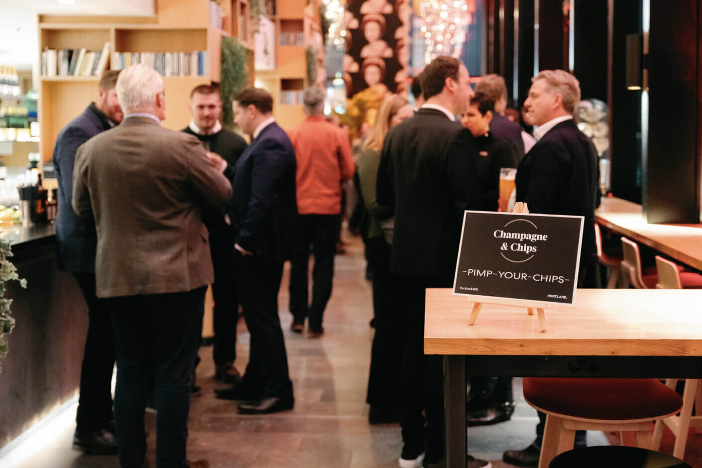

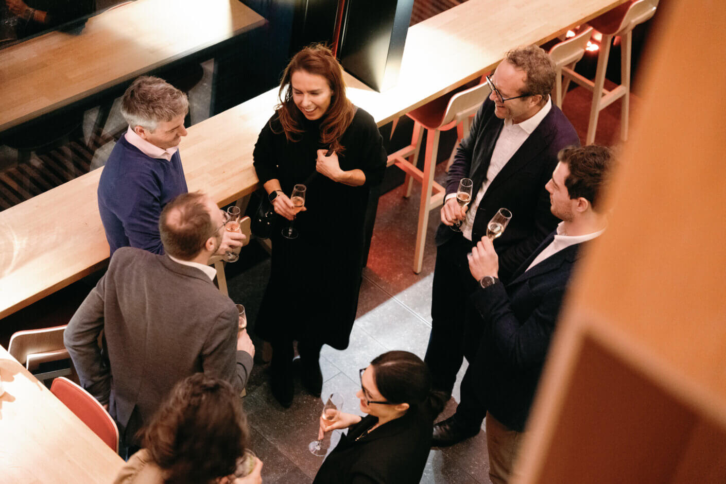
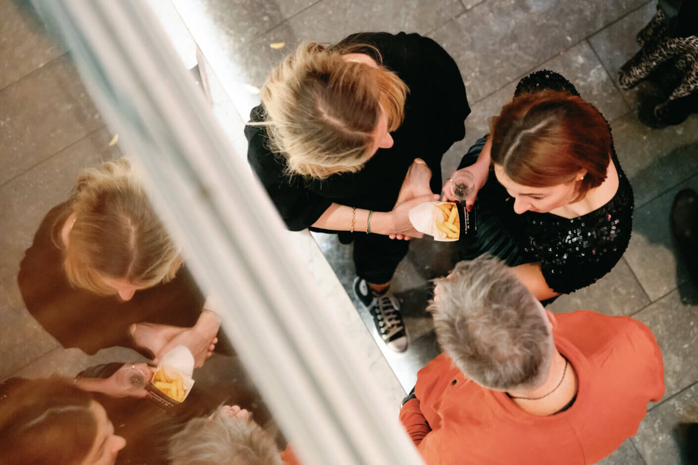
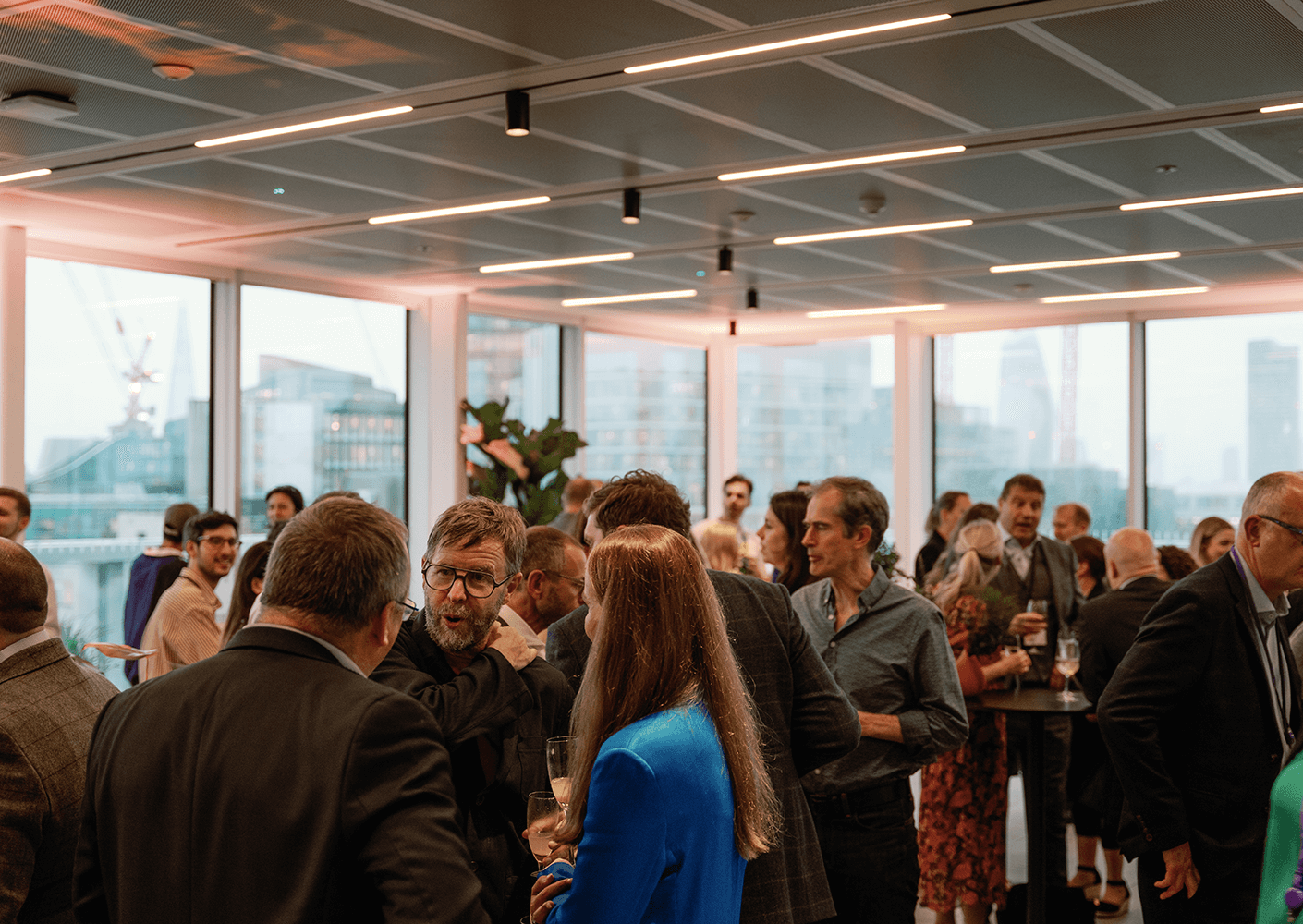
In early December we hosted our annual networking event Champagne and Chips! Thank you to all our wonderful guests that attended to make it such a great evening. Click here to see more photos from the night. 📷 @seenbyollie
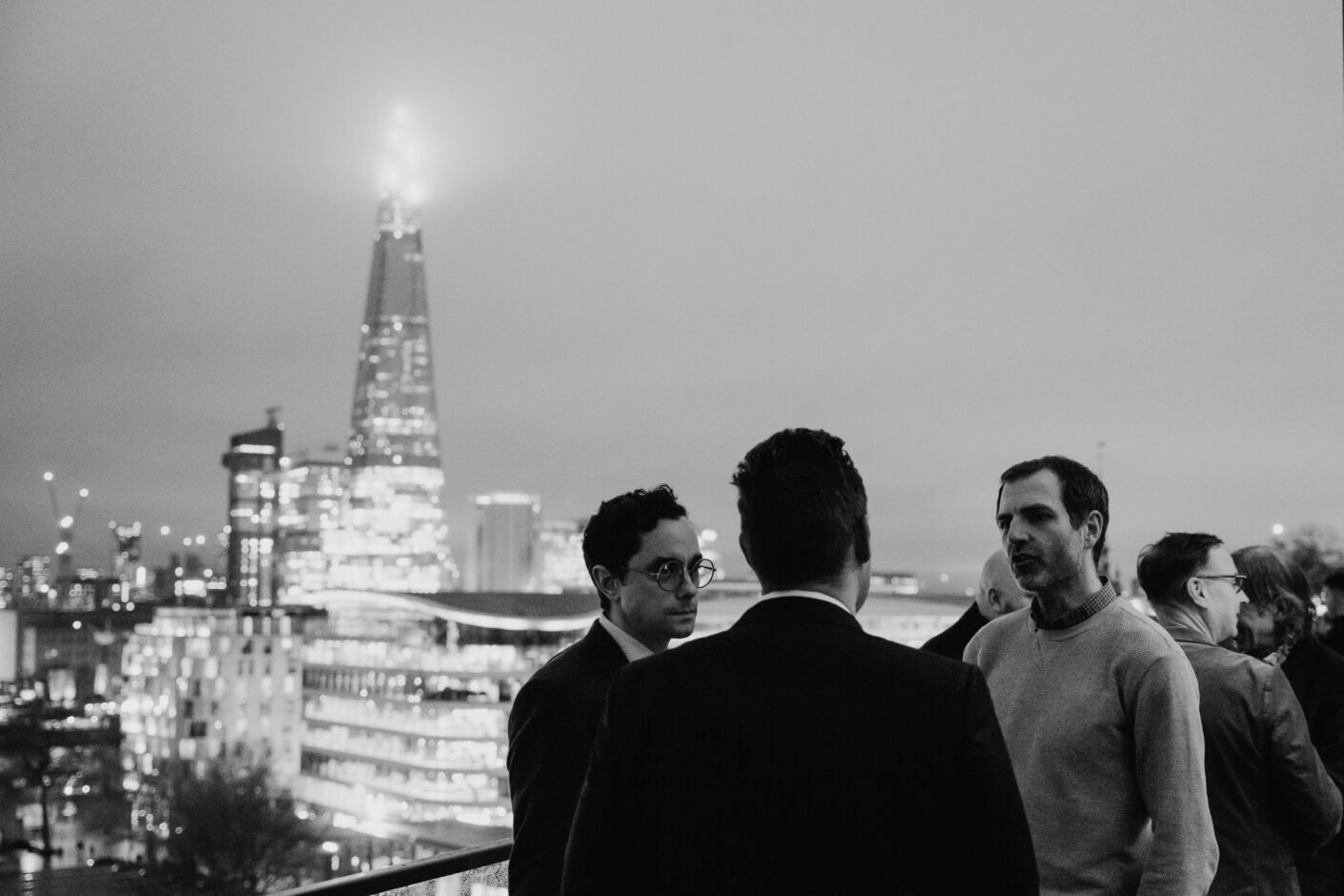
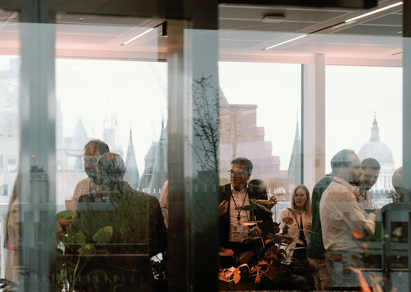
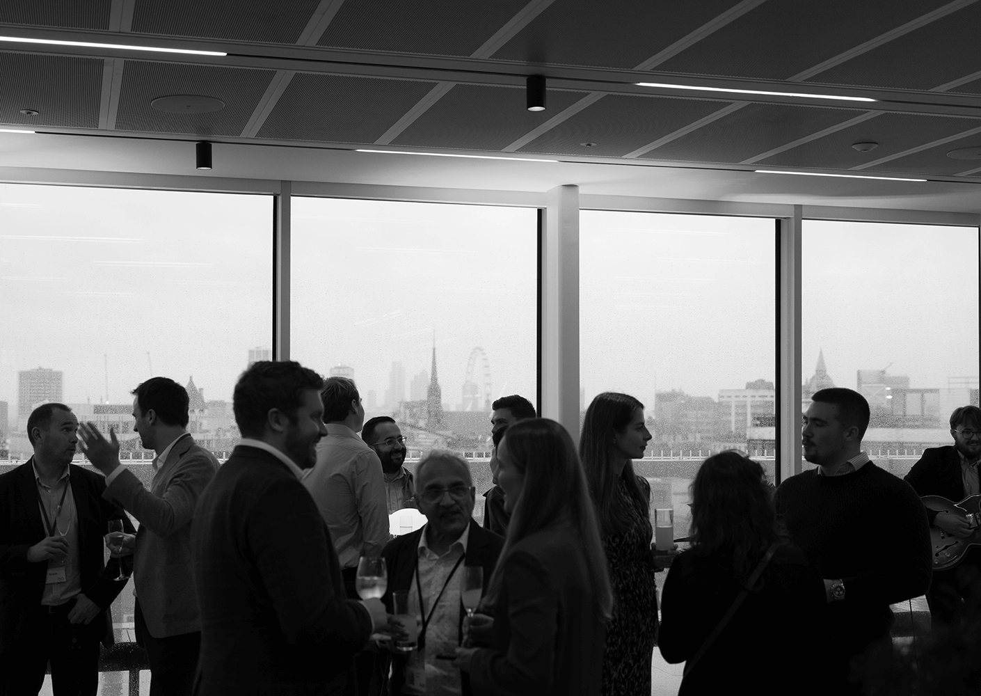
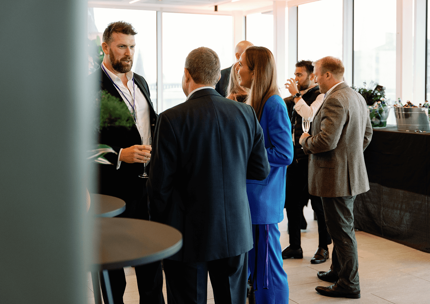
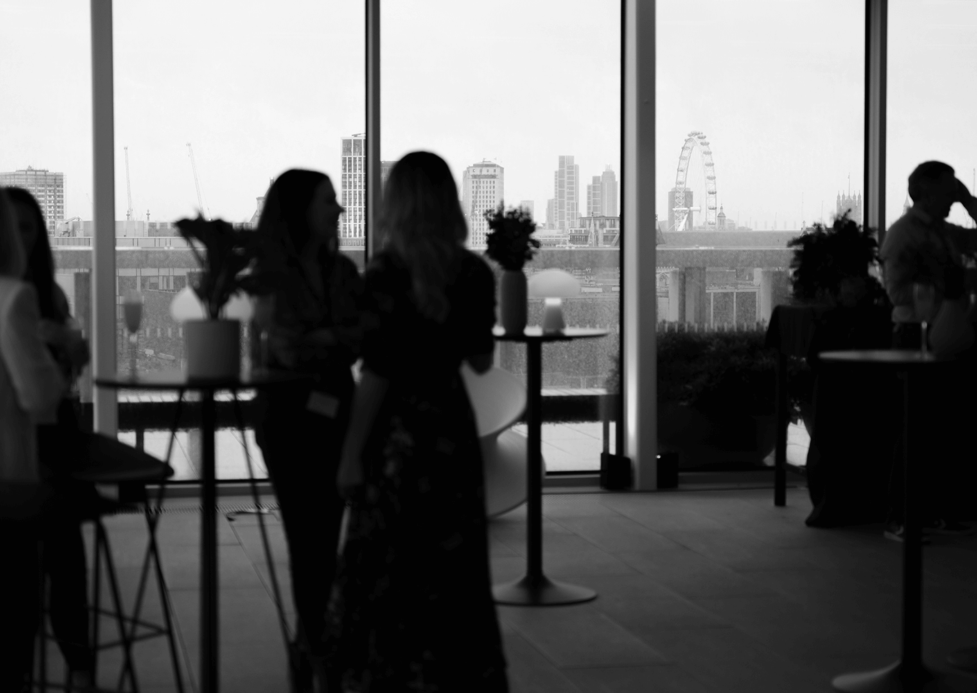
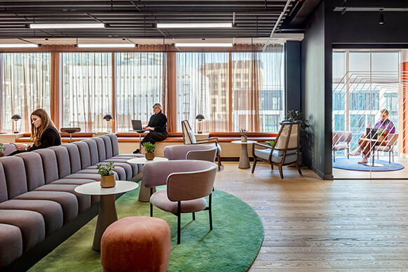
Despite biblical rain, we hosted the first Perkins&Will Skyline Soiree on the stunning rooftop of our new home at 150 Holborn. The atmosphere was wonderful and the space filled with cherished clients, friends, and collaborators.
Click the link here to see more photos from the night from the talented @seenbyollie
Each person at Perkins&Will brings their uniqueness, experience, and creativity to the table, to help us create the most inspiring places and spaces. We’re excited to introduce Rafael Marks, one of the Architecture Principals in the London Studio! Rafi has a wealth of experience and has worked on a diverse portfolio of award winning educational and health projects, as well as expertise in client engagement, project management and championing sustainability. His inclusive and open approach brings out the best in our teams, ensuring everybody remains enthused. We think you will really enjoy getting to know him!

Being named ‘Practice of the Year’ is a true celebration of our collective achievements and reaffirms our commitment to the industry and our clients, whilst simultaneously nurturing a thriving and inclusive work environment. Together, we will continue to push boundaries and shape a brighter future.
Our clients, Shirley and Louise, from Grenfell Early Years Nursery joined us at the awards ceremony and said, ‘the nursery benefits, and will continue to benefit, so many children and their families, both now and in the years to come. It is a truly valued asset within our community, and we’re delighted to see that the space has been recognised for its positive impact through this prestigious award’.

If you are committed to design excellence, thrive in a collaborative environment, have a passion for sustainability and are highly creative, join us in changing the world through design!
We are recruiting new graduates who are talented, enthusiastic, ambitious, and keen to work on our exciting projects.
Submit your digital cover letter, CV, and limited examples of your best work (maximum of four), to: [email protected], ensuring file sizes are below 10MB.
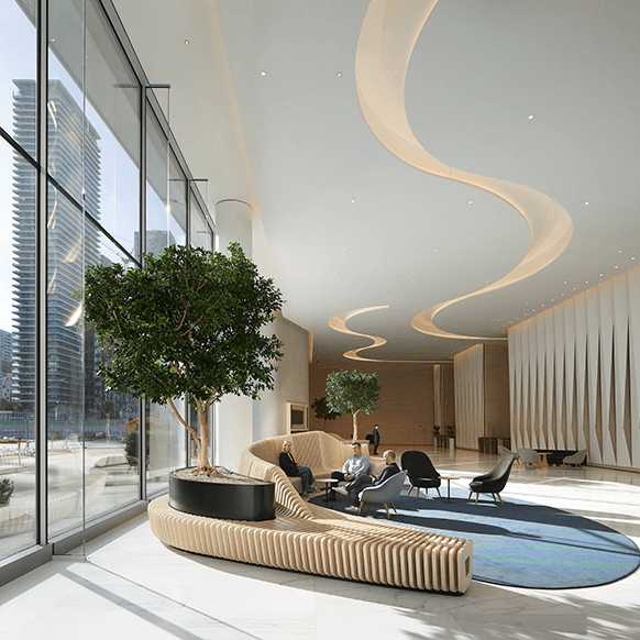
The European Bank for Reconstruction and Development (EBRD) had an ambitious vision from the start: to create a best-in-class workplace, setting the benchmark for office design, and challenging the status-quo in sustainability.
Their new workplace is functional, flexible and encourages full mobility to support their needs in a fair and transparent manner, reflecting the Bank’s cultural diversity.
Through a coco-creation approach, we worked with the EBRD to include everyone within their organisation in the creation of their new headquarters, fostering a culture of choice, collaboration, and innovation.
Designed by our London studio, this landmark project celebrates the meaningful work that the European Bank for Reconstruction and Development (EBRD) undertakes, with design concepts inspired by the world’s geographies. The vision for Five Bank Street was to co-create and deliver a best-in-class working environment for the EBRD’s new headquarters, with an emphasis on wellbeing, sustainability, diversity, and inclusion, while fostering a culture of choice, collaboration, and innovation. Through a co-creation approach, the project team collaborated with the EBRD to navigate the scope of the transition, involving all members of the organization on the journey to create the new headquarters.
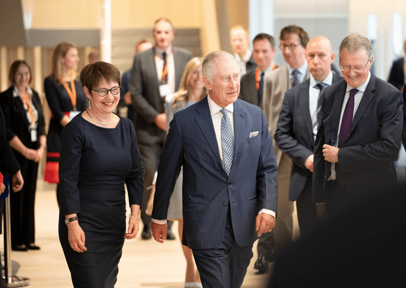
King Charles III visited Five Bank Street in Canary Wharf, London, to officially open the EBRD’s new headquarters. Designed by our London studio, this landmark project is a celebration of the meaningful work that the EBRD undertakes and the design concepts were inspired by the geographies of the world. The vision for Five Bank Street was to co-create and deliver a best-in-class working environment for the EBRD’s new headquarters, with an emphasis on wellbeing, sustainability, diversity and inclusion, and a community that fosters a culture of choice, collaboration, and innovation.

Jo brings extensive knowledge of the UK market to the firm, with over 30 years of experience leading the design and delivery of projects across a wide range of scales and sectors, including commercial offices, hospitality, culture, higher education, healthcare, and urban design.
The announcement has been featured in Architects’ Journal, read the full article here.
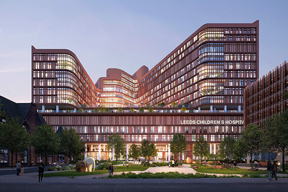
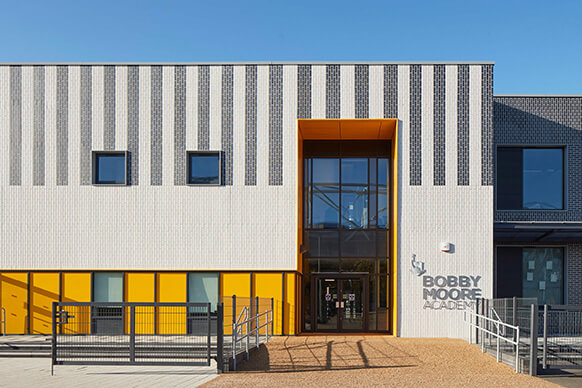
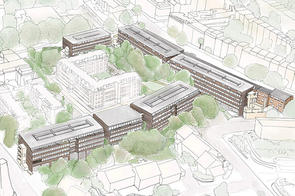
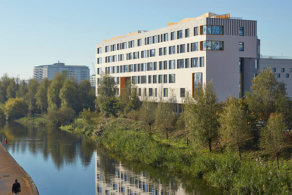
We design with purpose, discover our projects below:


Socialize with London